Monthly Archives: January 2017

Visual Rhetoric Artifact #1

Donald A. Norman’s discussion of tea and teapots in Emotional Design: Why We Love (or Hate) Everyday Things made me reflect on my own love of coffee as a cognitive/emotional enhancer, as well as a daily ritual. The Waffle House coffee mug (pictured above) is by far my most treasured coffee cup for a number of reasons. I only just purchased this mug about a month ago from a Goodwill in Easton, Maryland. Having recently regretted passing up a very good find at this thrift store (R. Kelly’s 2003 club anthem “Ignition (Remix)” on vinyl), I knew I had to purchase this coffee mug from the moment I saw it—and then held it in my hand. Norman argues there are three key aspects of design: the visceral (having to do with aesthetic experience), the behavioral (having to do with the pleasure an object brings and its effectiveness), and the reflective (having to do with the intellectualization and rationalization for owning the object). First of all, I am a rabid fan of Waffle House. I view this mug as an extension of the Waffle House experience, eliciting deep interpersonal ties and a sense of nostalgia. As an aesthetic experience, the mug harkens back to 1950s diners. The mug depicts the steam coming from a cup of coffee in the form of a cosmic spiral, alluding to the 1950’s emphasis on rocketry and all things aeronautical. From a behavioral level, or ergonomically, the mug fits the user’s hand perfectly—like a glove. What you cannot see from the picture is the overall thickness of the mug. From a usability perspective, the mug’s thickness does decrease the volume the cup can hold. In a diner, this size is perfect because the customer can keep asking for refill after refill, providing one satisfying experience after another. At home the mug’s thickness can make using the mug somewhat impractical because the user has to keep getting up for refills. However, the overall feel and the reflective aspects of the mug (as a carrier of overall Waffle House-icity) makes this cup one of my most valued trinkets, something I use almost everyday, leading to a more positive attitude and better overall quality of life.

Visual Ideology: Moving Beyond the Image

Visual Ideology Pinterest

In “Rhetoric of the Image” Roland Barthes asks, “How does meaning get into the image? Where does it end? And if it ends, what is there beyond?” (152). It is this question—what is beyond the image—that I am trying to answer in my current research. Moving beyond the image pushes us into the realm of ideology. To help answer this question I will be drawing from scholars in visual rhetoric and functional linguistics. The linguist Ruqaiya Hasan argues that meaning arises out of a dialectical relation between a text and its social context. To study the social construction of ideology, we need not only deal with semiotics, but semantics, the study of meaning, as well. So one of my major research questions is how to map the semantic plane of ideology bridging visual texts and social context.

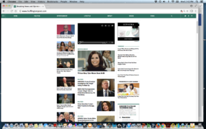
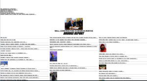
Take, for instance, a comparison of the visual design of the front pages of Drudge Report and Huffington Post. Both pages, visually, are nearly identical. Drudge did popularize the triptych or three-paneled layout that is now a hallmark of most news websites. Yet, if the websites are so similar, how are they able to construe such different ideologies and be geared to such different subjects? The websites’ denotations are quite similar, yet their connotations could not be more different.

One way ideology is at play here is the complimentarity between text and image. Both sites choose unflattering pictures of their opponents to help discredit their opposition. The sites may use the same image but attach negative or positive textual statements to that image. Yet, even the complimentarity between text and image does not fully explain how ideology is conveyed. Both sites could publish the same image, knowing their viewers would respond differently. So, we need to move beyond the image and begin mapping the semantics that arise out of text and social structure. Using Charles Peirce’s terms, we would have to posit that both sites assume a different interpretant. In other words, each site assumes a different type of reader, from a different social context while simultaneously producing different subjectivities that interpellate the viewer. Huffington Post would appear to have a more narrative structure and editorial stance because Drudge does not produce news content, just aggregates news from other sites. However, Drudge is by no means ideologically transparent. The site is meticulously designed and curated to present a particular ideological view. Lastly, we cannot assume that the connection between signifier and signified is completely arbitrary, as Saussure argues, or we would have no way of analyzing why news sites are designed as they are. There are important ideological and semantic reasons for structuring a news site around a large headline, with less “important” headlines underneath.

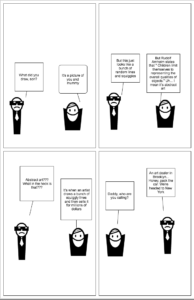
Visual Rhetoric Comic Strip